
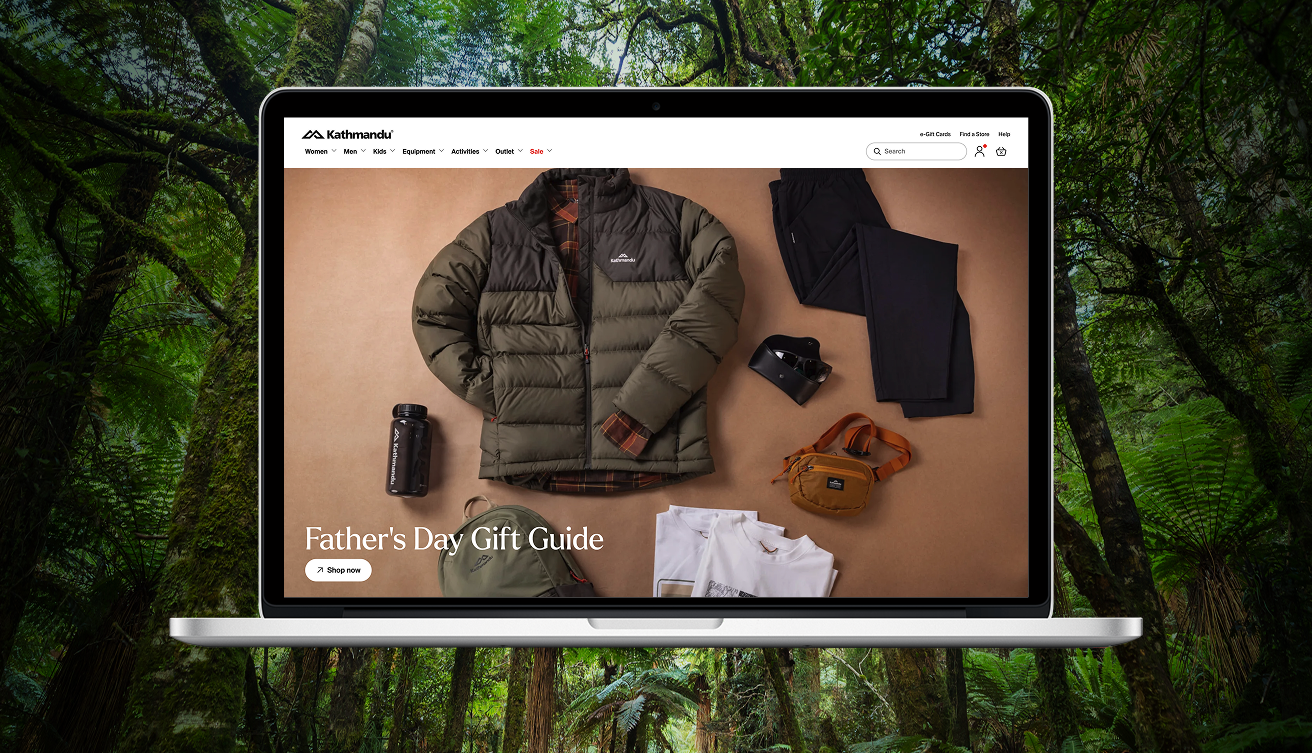
Redesigning an ecommerce platform that gives product strategy room to move.

Kathmandu, Outdoor retail – A Replatform for a large ecommerce site

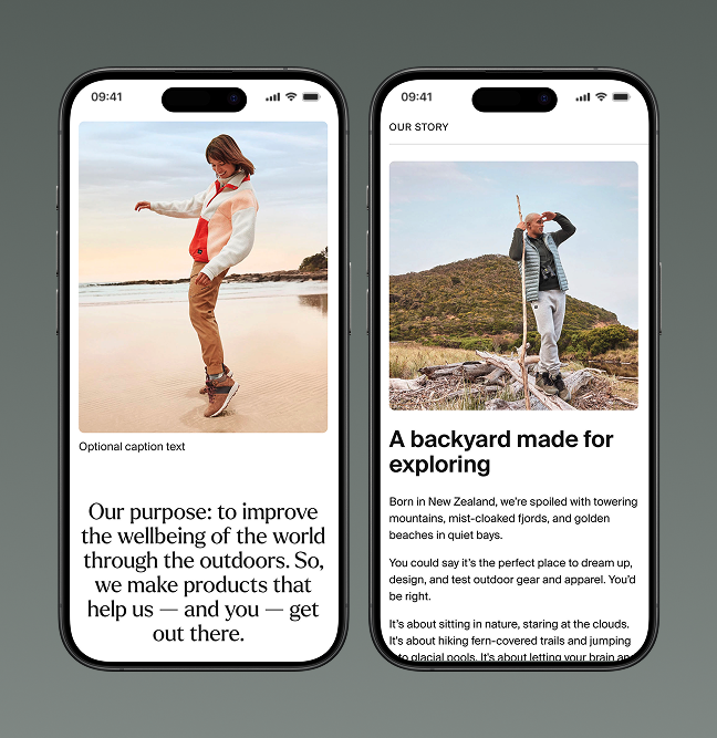
Kathmandu is an outdoor clothing and equipment retailer with stores across New Zealand and Australia. As new leadership pushed to lift digital sales in a hyper-competitive retail market, the business needed its freshly developed brand positioning to show up consistently everywhere customers found it, starting with a new eCommerce platform. We helped Kathmandu's own digital team build a design system built to carry that positioning anywhere it needed to go.

Kathmandu had just relaunched their brand: "We're out there. Come find us." New rebranded flagship stores were being rolled out to key locations. But their website had been underperforming, and the team needed to re-platform it, both for the flexibility their product strategy demanded and to make everyday editing simpler.
Kathmandu needed to have more flexibility when it came to how it managed product strategy. It was key they could treat their website like they would be merchandising a bricks and mortar store. The previous iteration had been difficult to change and adapt, and they needed to be able to work at a much faster pace.

Building it with the team who’d own it.

Kathmandu’s Digital Team didn't just need to build something that reflected the new brand. They needed a system flexible enough to keep pace with seasonal campaigns and changing product ranges, and durable enough to still belong to Kathmandu long after our team moved on.
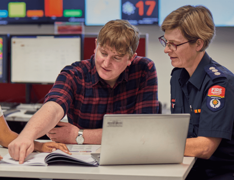
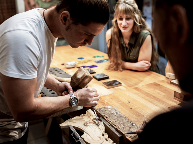
We joined a hybrid team spanning Melbourne, Christchurch, Auckland, Wellington, and Taiwan, working alongside Kathmandu's own designers from the first workshop.
Together we set the KPIs the work needed to hit, including lifting the online channel toward a quarter of total sales, then moved from competitor scanning and mood boards through to a concept direction Kathmandu's leadership could stand behind.
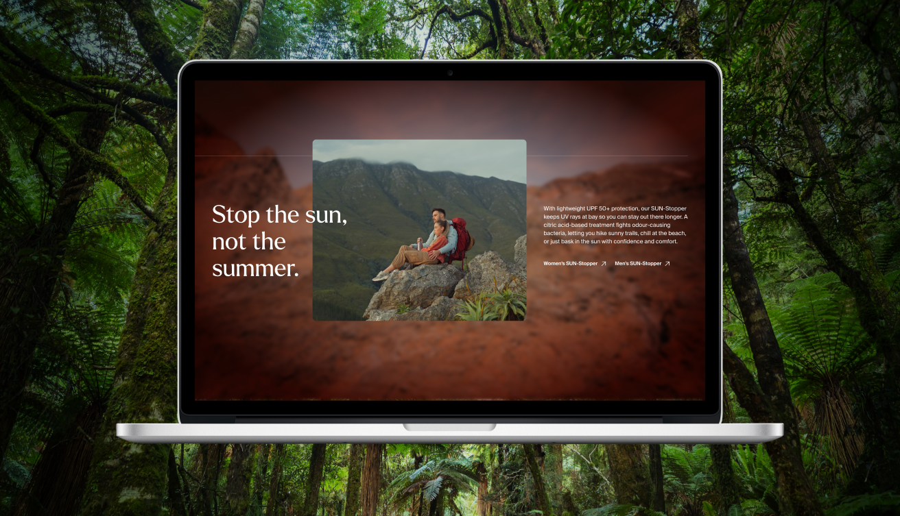
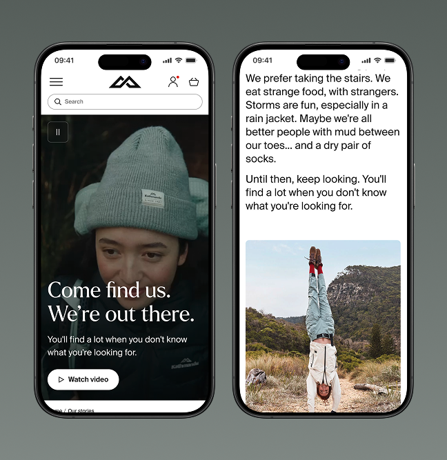
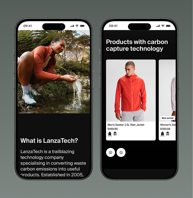
We designed ways of profiling key product segments with simple storytelling moments. This meant Kathmandu could better plan for seasons and how even current weather could become a tactical component of product strategy

Where ownership sat with Kathmandu, by design.

Understanding what users felt:
Kathmandu's team ran the audience testing themselves, with Ghost supplying the learning plan and iterating designs against what they found.

Building a system that was repeatable and scalable:
The design system was handed over as a living Figma file, with guidance on publishing it through Zeroheight (a tool for sharing design systems beyond the design team) so more of Kathmandu's people could use it, not just the designers.

The importance of doing co-creation well.

The co-creation process started wide, with an ecommerce framework to think inside, then sharpened as the work deepened. That meant spotting where the opportunities were, building support for ideas across the internal team, and selling the stronger ones up to project owners, while getting to grips with conditional forms and best practice across ecommerce journeys.

We worked tightly in sync with the Kathmandu team, getting face to face for the moments that mattered. Handovers were well documented, so the design system could move into their environment and work without friction from day one.

User testing ran alongside the whole way, keeping the project on track and giving us the evidence to balance priorities and opportunities pragmatically against time and budget.

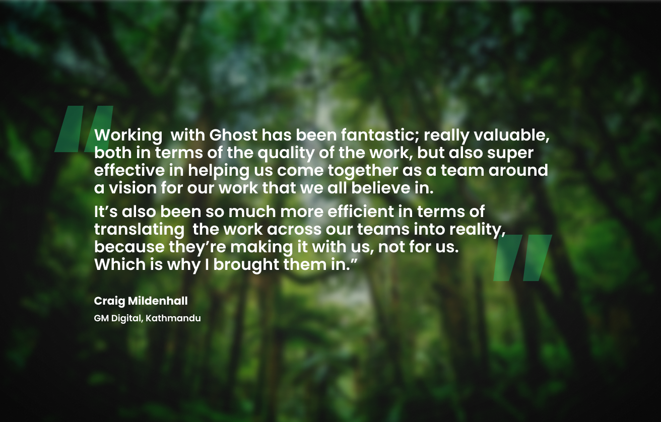
Working  with Ghost has been fantastic; really valuable, both in terms of the quality of the work, but also super effective in helping us come together as a team around a vision for our work that we all believe in.   It’s also been so much more efficient in terms of translating  the work across our teams into reality, because they’re making it with us, not for us.
Which is why I brought them in.” Craig Mildenhall
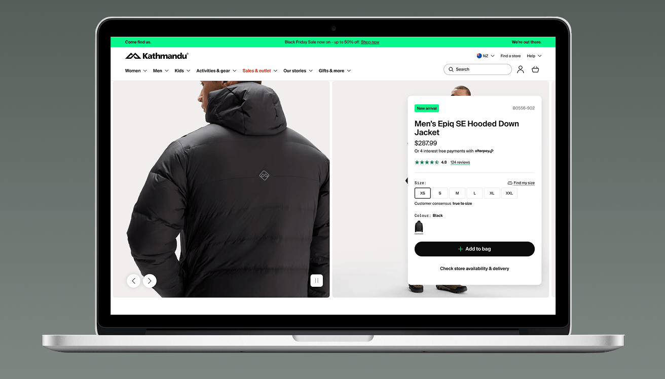
A laptop mock up showing the product description page of the Kathmandu website
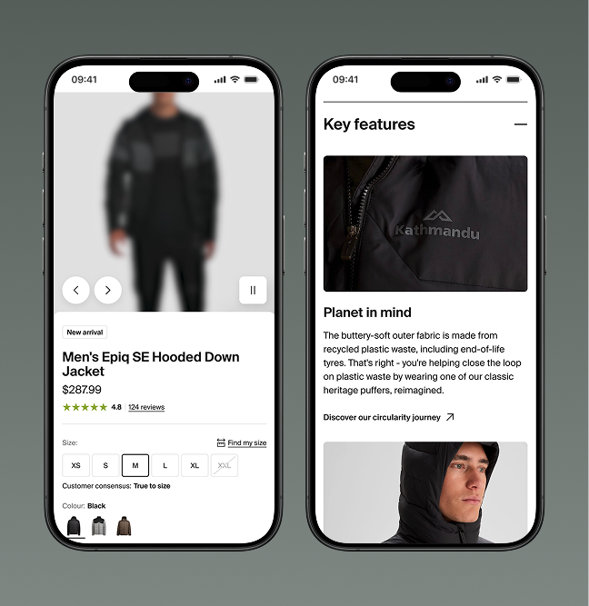
One of the key challenges was developing a consistent way to surface detailed product information. We wanted the product pages to feel more tactile, giving users several ways to interact with content, particularly imagery. Through it all, the call to action had to stay front and centre so nobody got lost on the sales journey.
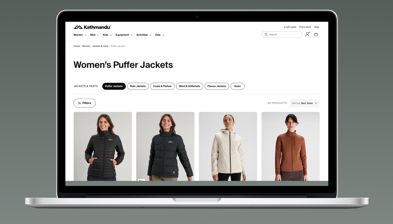
With so many product categories, filtering and sorting had to be easy and built entirely around the user. At any point, users could see relevant options surfaced, whether product type, format, colour or price. In ecommerce, every extra step between a shopper and the buy button costs you conversions, so the path to purchase had to stay short.

Building in innovation along the way.

Part of the brief went beyond ecommerce best practice: where could we take the experience further for customers? We looked for moments of delight, and for ways those moments could drive sales even harder.

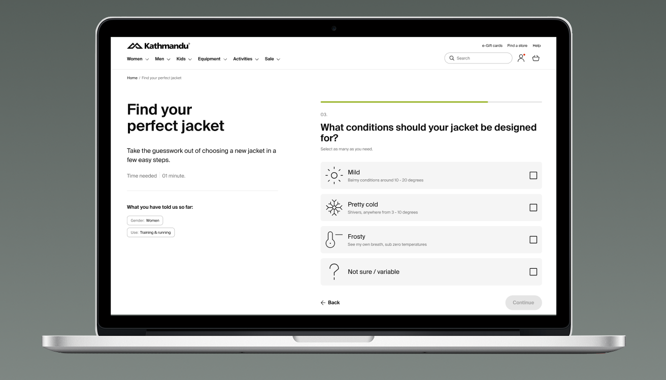
The concept phase surfaced plenty of ideas, and each got the acid test for feasibility and viability. Could a weather-related widget push the right products to the fore when a southerly rolls in? Could we help customers to find their perfect jacket through a simple contextual quiz?

Even the ideas that hit the cutting room floor earned their keep. Many made it in more subtly, drawing on Kathmandu's back-end systems and their unusually deep well of product data and content.

We built in several different ways to discover products. Jackets are a good example: with so many types on offer, choosing can get confusing fast. So for categories like this, we built a simple quiz that helps customers work out exactly what they need.
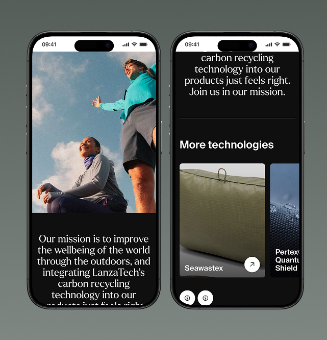
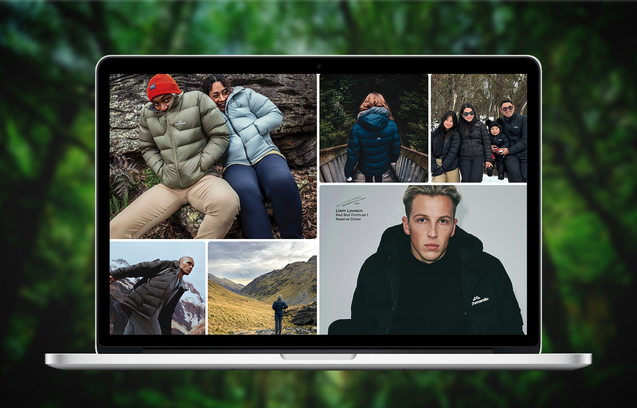
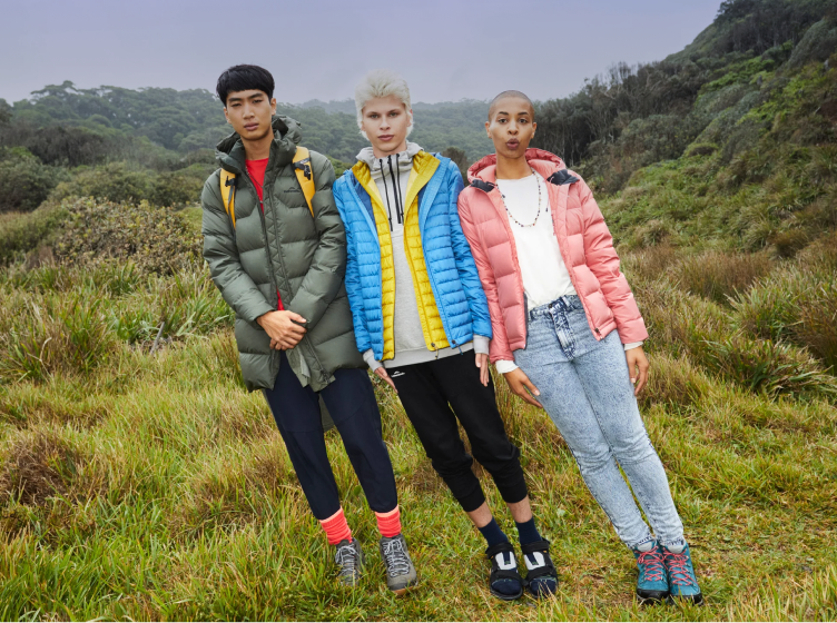
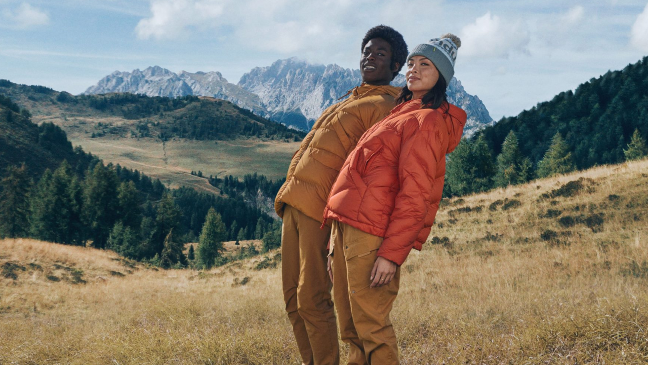
Kathmandu had become really good at building deeper, richer stories around their products, especially key segments like their puffer jacket staples. We developed a bento box approach for these, surfacing everything from the product in use out in the environment to key endorsements.

Right content, right time.

We used a bite, snack, meal approach to decide what type of content goes where, all in aid of the sales journey. Customers arrive in different need states: some want a quick hit, others want to settle in and explore. So we surfaced bite-sized content that could open into deeper layers, right through to full-meal content for the areas worth lingering in.

The model became a way of framing everything: a card, a component, a carousel or a full page, depending on the job it had to do.

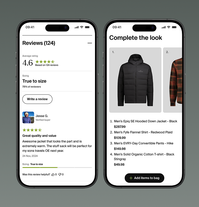
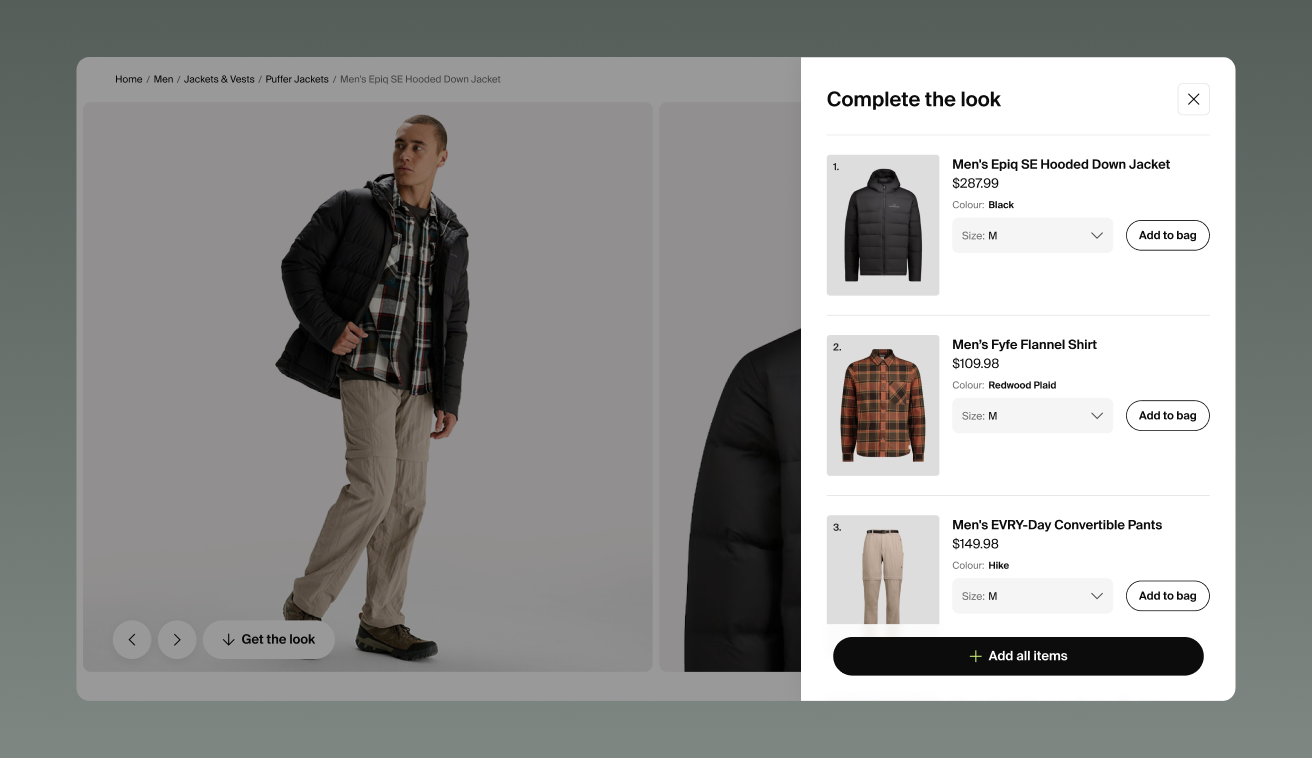
Cross-sell and upsell were built into the experience, led by a 'complete the look' component that assembles a whole outfit around the product in view. Multi-buys were curated to work together and make sense as a set. And by suggesting like products at the right moments, we took the choice fatigue out of browsing: users spend less time deciding and more time buying.

A system that scales with the brand.

What we delivered is a complex system that feels simple. Getting there took more than understanding the Kathmandu brand; it took understanding the needs driving the team behind it.

The effects showed up from day one. Analytics showed people moving to purchase faster, with fewer abandoned carts along the way. And behind the scenes, a simpler, editable back end gave the team room to plan product strategy properly and move quickly when conditions change, like a cold snap driving puffer jacket demand.

The result is a site that’s no longer just a shopfront. It’s a living, breathing representation of the brand, out there to create that little bit of delight for customers to find.

Kathmanduʻs GM Digital said the work landed because the two teams built it together, describing the collaboration as “they're making it with us, not for us, which is why I brought them in.” That's the shift we set out to make: a design system Kathmandu's own team could take, apply, and keep evolving long after the project wrapped, built to move at the pace a hyper-competitive retail market demands.

SHARE ARTICLE

More case studies