Bringing cohesion and pace to a complex global merger.

Borouge International, Energy and petrochemicals, United Arab Emirates

Three companies in three continents were merging to form one new global business. Borouge International was formed from the combination of Borealis, Borouge and NOVA Chemicals. Ghost Dynamics was the digital experience and development partner that designed and built its first website: a single online home for the merged company, launched in four languages to land the moment the merger was announced to the world.

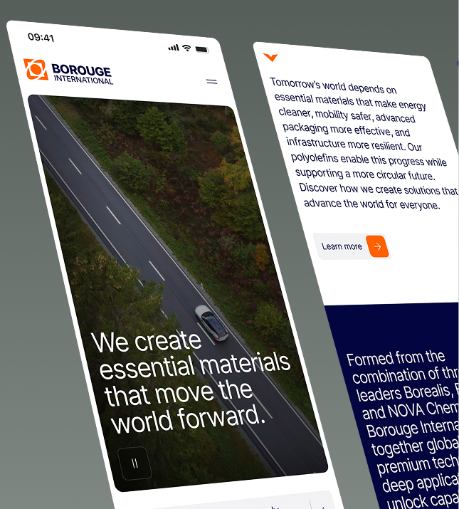
The website had a big job. It had to introduce the merger in a way that honoured all three companies, while showing the scale and capability the combined business now brought.

Designing for a market leader

Borouge International is one of the world's largest producers of polyolefins, the versatile plastics used in everything from food packaging to pipes and car parts.

It was formed in early 2026, when three companies came together: Borealis in Europe, Borouge in the Middle East, and Nova Chemicals in North America. We designed and built the new company's first website, a single home for the merged business, ready to go live the moment the merger was announced to the world.

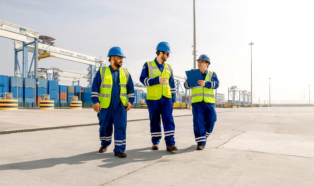
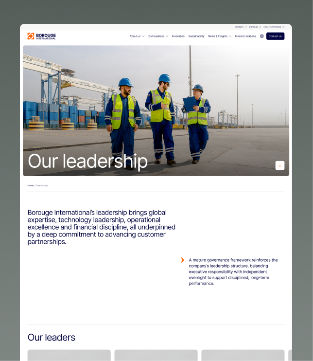
Three workers in safety gear are conversing as they walk together across a large empty yard at a port.
The timing and scale of this project was one thing, but the relationships between the project partners was the most crucial thing to get right. Timezones were navigated carefully to make sure the right people were across key points of the project, making sure everyones voice was heard when it needed to be

Working hard from Day One.

The new company had one chance to introduce itself. Three well-known names, each with its own history and following, needed to appear as a single, credible business from the first moment anyone looked.

Content, brand direction and approvals were still coming together across several teams and time zones, and the window to build was short. The client needed a partner who could move quickly and stay steady when the pressure was on.

The launch was a coordinated global event. The press announcement and the website were timed to land together, in front of shareholders and media across the Middle East, Europe and North America.

The minute the announcement broke, the website had to do a few hard things at once:

A unified front:

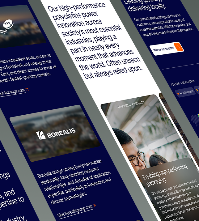
We had to knit together three well-known companies and present them as one unified, coherently articulated business.

Cross the language barrier:
The website had to work fully in English, German, Arabic and Simplified Chinese, and alongside that, make sure cultural nuances were taken into account.

Different strokes:
It had to speak to investors, customers, employees, media and government audiences, and do it in a way that accounted for the things they needed to hear

All of it inside a compressed window, with content, brand and approvals flowing through several teams and time zones.

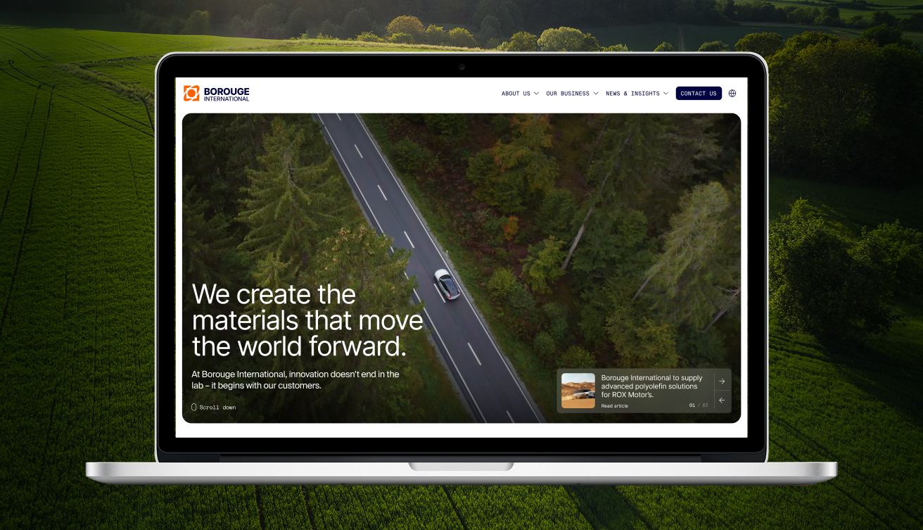
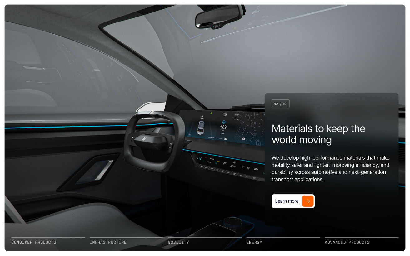
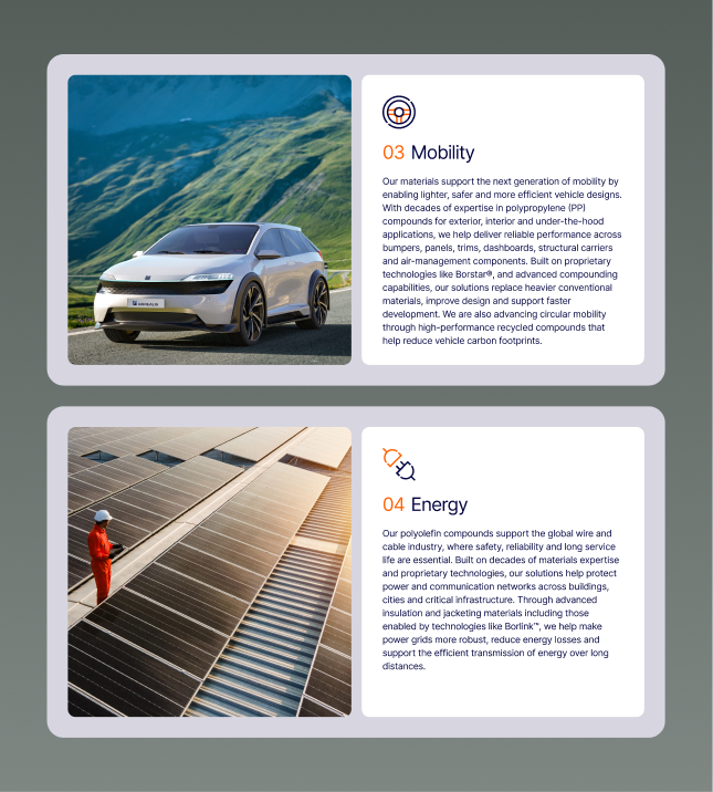
Product screen, introducing Mobility Products
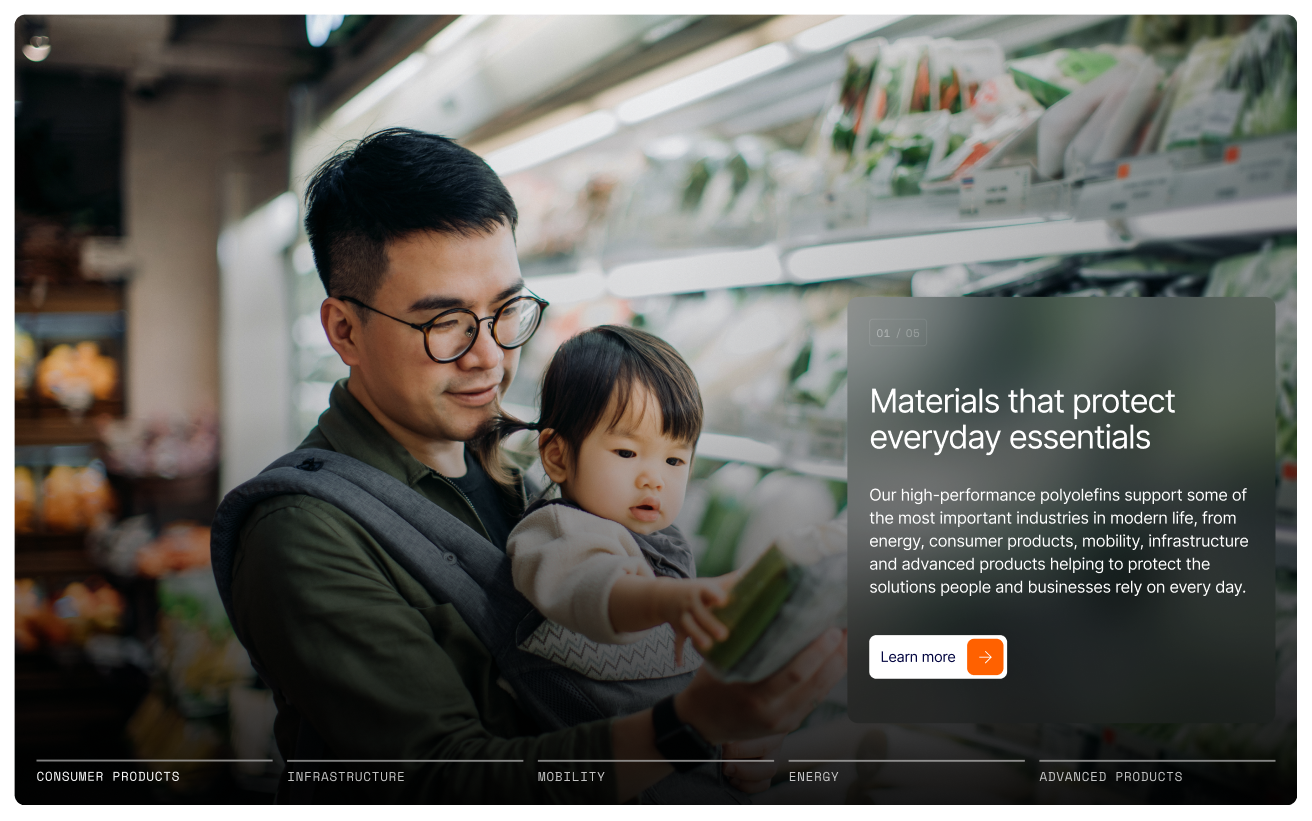
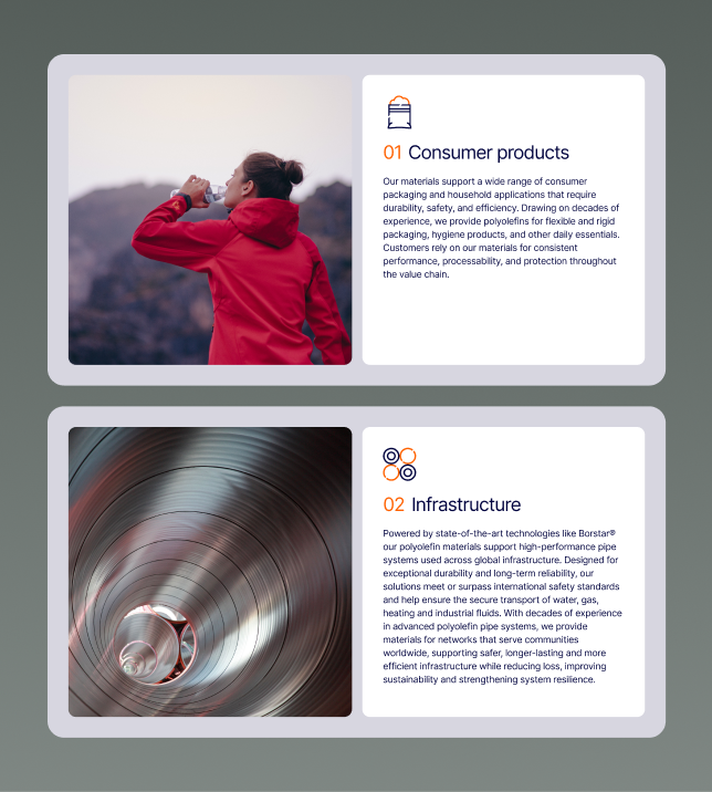
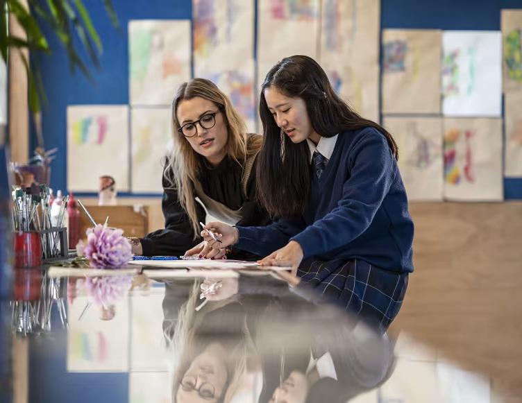
Product screen, introducing Consumer Products
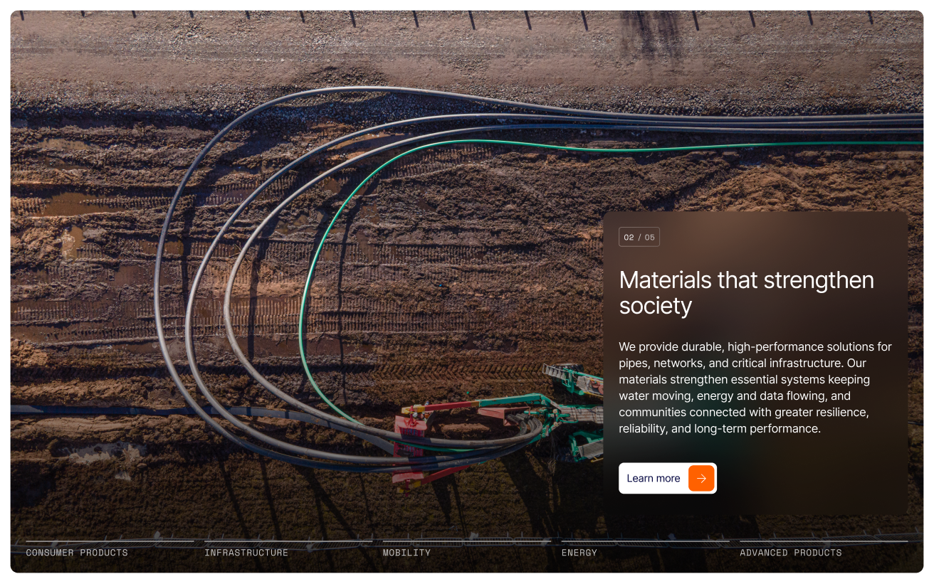
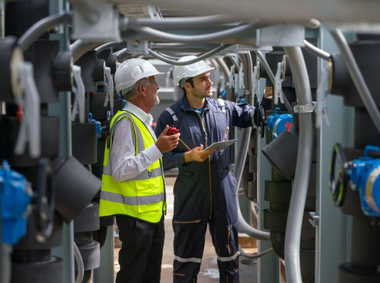
Product screen, introducing Infrastructure Products
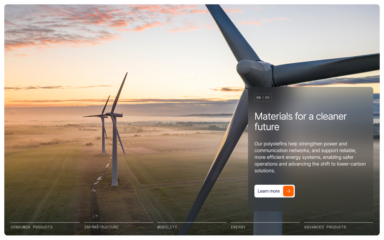
Product screen, introducing Advancd Products
Polyolefins are the quiet ingredient in modern life: food packaging that keeps produce fresh, lighter parts that make vehicles more efficient, sterile medical supplies, cables and pipes for energy and water, and insulation for homes and buildings. Brought together, the three companies serve this full range of industries at a scale few can match. We built modules that made that reach visible, and showed why these materials still matter today.

Built for a global audience.

Accessibility:

Built to WCAG 2.1 so the site is accessible across regions and devices.
Multilingual:

Designed and configured for four languages, including right-to-left Arabic and a Simplified Chinese version of the site.

Findability:

Optimised for search, including AI search, so the new entity was discoverable from day one.

Privacy:

The autoplay hero video hosted on the site itself, keeping the experience fast while staying clear of GDPR and UAE PDPL rules on external data.

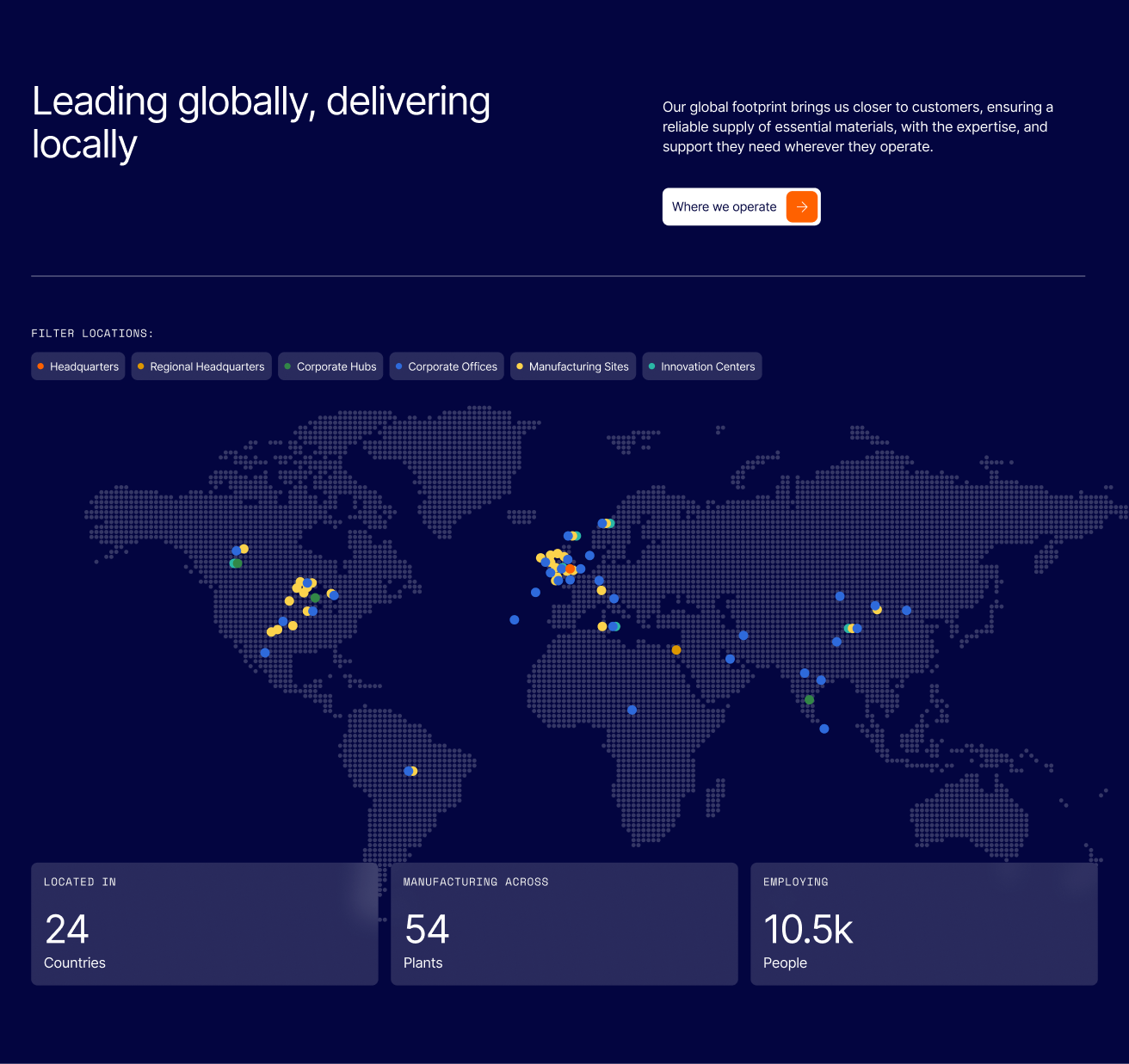
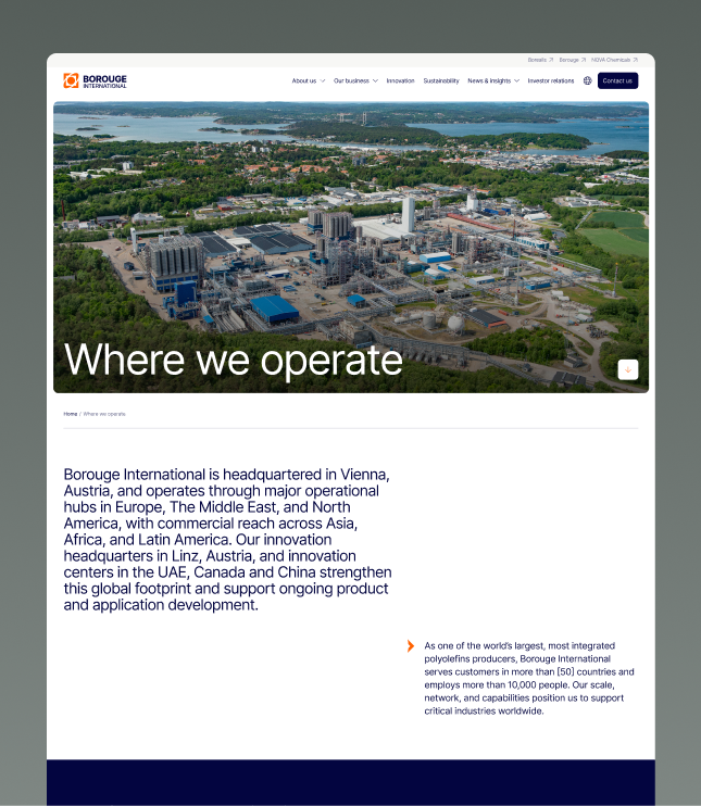
As one business, the company operates across the Middle East, Europe, North America and Asia. We built an interactive map so anyone could see that combined footprint at a glance and explore it by what each site does, filtering between operational headquarters, corporate hubs, manufacturing sites, plants and innovation hubs, with each point opening into a fuller page on that location.

Keeping a global group moving to one deadline.

A merger of this size means many people with a stake in getting it right. Teams from all three companies, Edelman coordinating the wider communications, and specialists across brand, content and translation, all feeding one site on a shared deadline.

Holding that together, across the Middle East, Europe, North America and Asia Pacific, was as much of the work as the design and the build. We ran it as a clear, staged process, so the whole group knew what was being decided and when, with each approved stage setting up the next.

We also seconded a project lead to Dubai for the length of the build, working in the client's time zone and alongside Edelman day to day, with a second lead in New Zealand so the work could keep moving almost around the clock.

Being in the room, in the region, is what kept a complex group aligned and the trust high. We planned the handover from the outset too, so the site, its content system and its analytics could pass cleanly to the client's team, and we stayed on to support them well beyond launch.

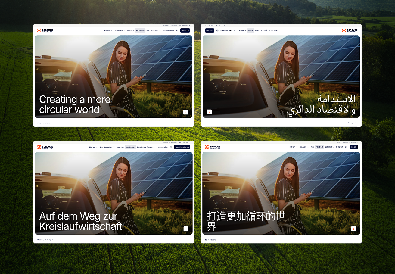
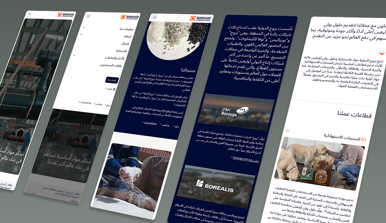
Four screen shots showing four different ranslations of the same page
The UI design had to accommodate four translations; English, German, Chinese and Arabic. This meant making sure all the components were left-right reversible for Arabic in particular.

Designing a repeatable and expandable platform.

We ran the work as a sequenced, dependency-driven design and build, each phase feeding the next: technology discovery, visual concepts, UX, UI, then development. Getting the foundations right early is what kept a tight timeline achievable.

Technology discovery came first. We evaluated CMS options against the things that actually mattered here: multilingual and right-to-left support, editorial workflows for content teams managing four languages, and room to grow into an Investor Relations hub and further phases later. Sanity was the recommendation, and the platform we built on.

Design worked across every language from the start. Arabic was designed right-to-left in its own right, not a flipped version of the English layout, with Simplified Chinese, German and English each given their own consideration. Concepts were shared with stakeholders across all three companies, refined, and taken through to final UI for desktop and mobile.

Designing the Arabic was never a simple left-to-right switch. We reworked hierarchy and reading direction so the page flowed for every language, and made sure the typography held up across all four writing systems.
Delivered to the minute.
The site went live on 31 March 2026, timed to the coordinated announcement, and ran steadily across every region from the moment it launched. We stayed on afterwards as the support partner, keeping the site healthy and adding content as the business moves towards its later phases.

Bringing it home.

On the day it became a company, Borouge International had one clear, credible home that spoke to the whole world at once, in every language its audiences read. Three histories, one voice, live to the minute.

SHARE ARTICLE

More case studies